Ireland (EUR)
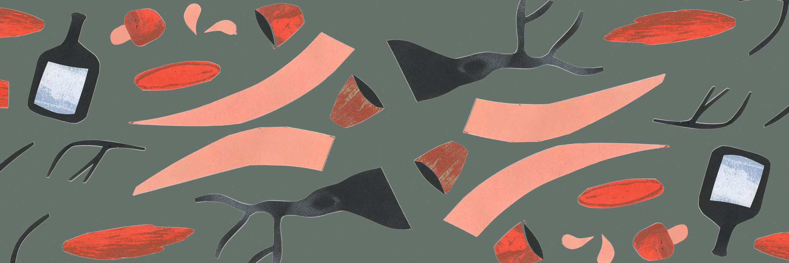
Book designer Lisa Benk shares her story about collage, inspiration, and what an good book cover should look like.
Lisa Benk works as a book designer and enjoys working with collages and handwritten typography. After completing her education in graphic design and communication in Norrköping, she decided to move to Stockholm to work at a publishing house. Today she freelances full-time. Tag along as Lisa shares more about collage and how she works, as well as where she finds her inspiration.
Hello there, Lisa! You have designed quite a few book covers. What does a good book cover look like?
I do not believe it is possible to answer that question! A book cover should be appealing but at the same time tell us something about the contents of the book. A good book cover does not really need to mean that it is pretty to look at. There are of course some book covers more connected to certain genres than others. For example, mystery and crime stories usually look a certain way, and the same goes for feelgood novels. Even if they are not necessarily the most aesthetically pleasing, you will instantly understand what is what – and that means that the book cover is a good one.
Personally, I enjoy a mix of illustrations and large typography, uncut paper, preferably colourful but at the same time not too garish. I do also like when you feel like both the paper and binding have been chosen carefully. At the same time, a book cover should also work as a digital version with, perhaps, only a thumbnail presented. The entire package is important!
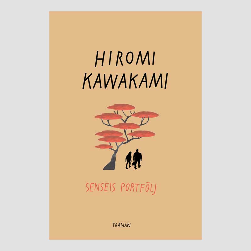
You have created the cover for The Briefcase or Strange Weather in Tokyo written by Hiromi Kawakami. Tell us about your thought process when designing the cover.
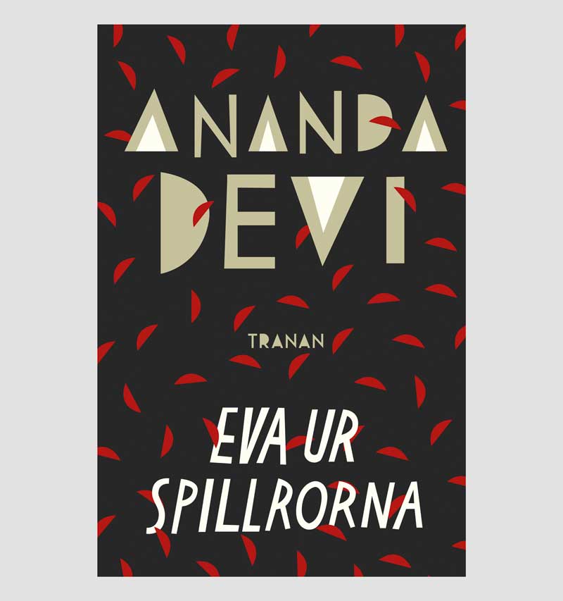
This book is a quiet little love story and they wanted a book cover that was simple. I wanted to capture something fragile and touching, so I decided to go for a rather simple, symmetric composition. I wanted to capture the feeling of Japan, without making it too obvious, and that is why the red tree is inspired by Japanese wood engravings. I created the typography by hand in my computer. It is quite angular but still with simple lines. In hindsight I realise that this is how I understand Japanese, both the spoken language and the written. I have actually studied Japanese, so this book cover is especially close to my heart.


Tell us about collage and how you work with collage.
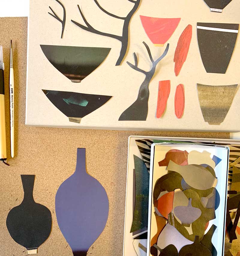
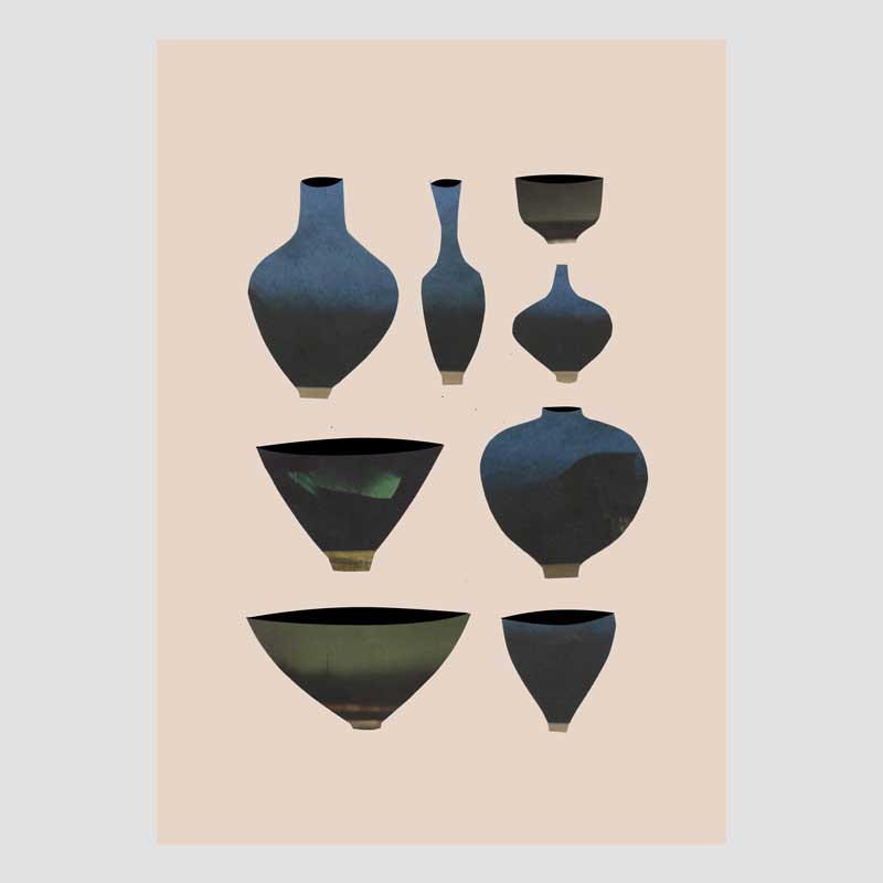
A collage is an image that is put together with different types of objects and materials. It can be parts of photos that, ones you put them together, become a completely new image. I usually use surfaces that I find and then cut into new shapes. These will later become an illustration, perhaps for a book cover. For example, I made a personal project of cut bowls and pots. At that time, I went through magazines to find whatever would make for a pretty “enamel” and once I found one, I simply cut a tiny pot or bowl out of it. It can be a small part of a photograph of a sofa or of a wall –if you know what you are looking for, you can find it pretty much everywhere.
When it comes to composition of images, how should one think?
I always try to create some sort of balance and harmony. It is hard to come up with tips of how to make it perfect, because it often comes down to your gut feeling. It can be helpful to print whatever you are doing on the computer, put it up on a wall, and take a step back. This is often a good way to get a feeling about the layout and to see if it is wonky or too heavy. What is so fun about designing book covers is that you always have both an illustration and typography to keep in mind at the same time. You need to keep it balanced. If all text is on the right, it can be balanced by having the “center of gravity” of the illustration or image to the left.
If you are having a hard time finding that gut feeling, you can always rely on the classical grid system, as in “the rule of thirds”. Divide the space in three parts, both height and width, and place the main object where two lines meet.
How do you work with text and composition on a book cover?
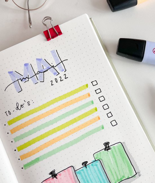
I do very much enjoy handwritten typography on book covers. I think it gives it a more alive and less stiff expression. Besides, it is very forgiving on the composition because you can control the size of the letters, both in relation to each other and how they are placed, without losing the feeling that they actually belong together. The typography sort of becomes an image in itself! This is especially nice if you are about to design a series of book covers that are supposed to interlink but have very different lengths of titles. I think it is easier to solve that problem by simply writing by hand and making the text a part of the illustration, instead of just using a font from the computer.
Where do you find your inspiration?
I spend a lot of my time on Pinterest, where I save all sorts of graphic design and then go back and look through my files. It is so much fun to look at other book designers’ work and to walk around in bookstores to check out different designs. I take inspiration from how they have found solutions for the typography and what materials they have used. You sort of collect ideas and whenever you need them, you can pick your own brain and put some of them together when the right project comes along.
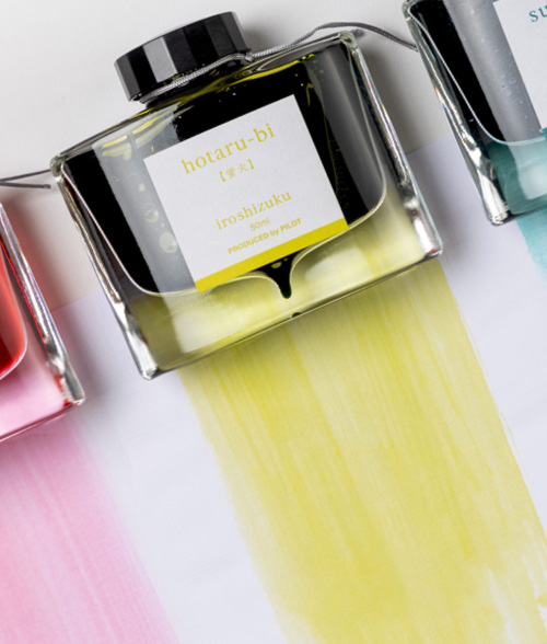
I do also take inspiration from the art by Paul Gaugain, Henri Matisse and Tove Jansson. Combinations of colour is also usually a foundation in the creative process. You see a pretty colour scale and start experimenting with it. And then, of course, the very book itself! The story and the characters. Something I appreciate with book design is that you do always have a text to fall back on. You never create something from nothing.
How do you go from collage to a finalised image to print on a book cover?
I cut parts of coloured paper, magazines, or whatever I have got at home. I do it physically, with scissors, or digitally with the Marquee tool in Photoshop. If I do it by hand I will scan my findings – but always part by part! Later, I put it all together on the computer. I do not want to get limited by the fact that I had glued something together that I will not be able to take apart later. On my computer I am free to change and move things around, perhaps alter the size of different components et cetera. Sometimes I will finish my image in Photoshop and save it with a transparent background. I always make the actual book cover using Indesign, that is where image and typography come together and are put into their specific spaces.
When I handwrite the typography, I always make it in black, preferably with a brush and Indian ink, or some marvellous felt pen. Afterwards, I will scan it and change the format of the file to bitmap. That way I do not have to risk losing the handwritten feeling. Later, I can change the colour of the text in Indesign. There is almost never a case where I have a set idea of a finished image or how something is “supposed” to be. I like to try different things. I have become pretty comfortable in the fact that it will all come together in the end, as long as you keep working. You keep changing colours and move objects around until it finally makes sense. Sometimes it will be resolved overnight, in my sleep. I think that is key when you work with book design, to let things be for a while and then look at it all with fresh eyes. All of a sudden something that felt incomplete yesterday feels perfect today.
For more book covers and illustrations by Lisa, visit lisabenk.se