Ireland (EUR)
Marita M Nilsen is an architect who uses colour charts to find the perfect colour combination before working on a larger scale. Through her colour charts, she gets to know the qualities of the pens, explores which shades work well together and discovers their different textures. We have been given an insight into how Marita creates her colour charts. Perhaps you might feel inspired and discover a new way to get to know your own pens? Join Marita as she shares her process step by step. We hope you pick up a tip or two along the way.
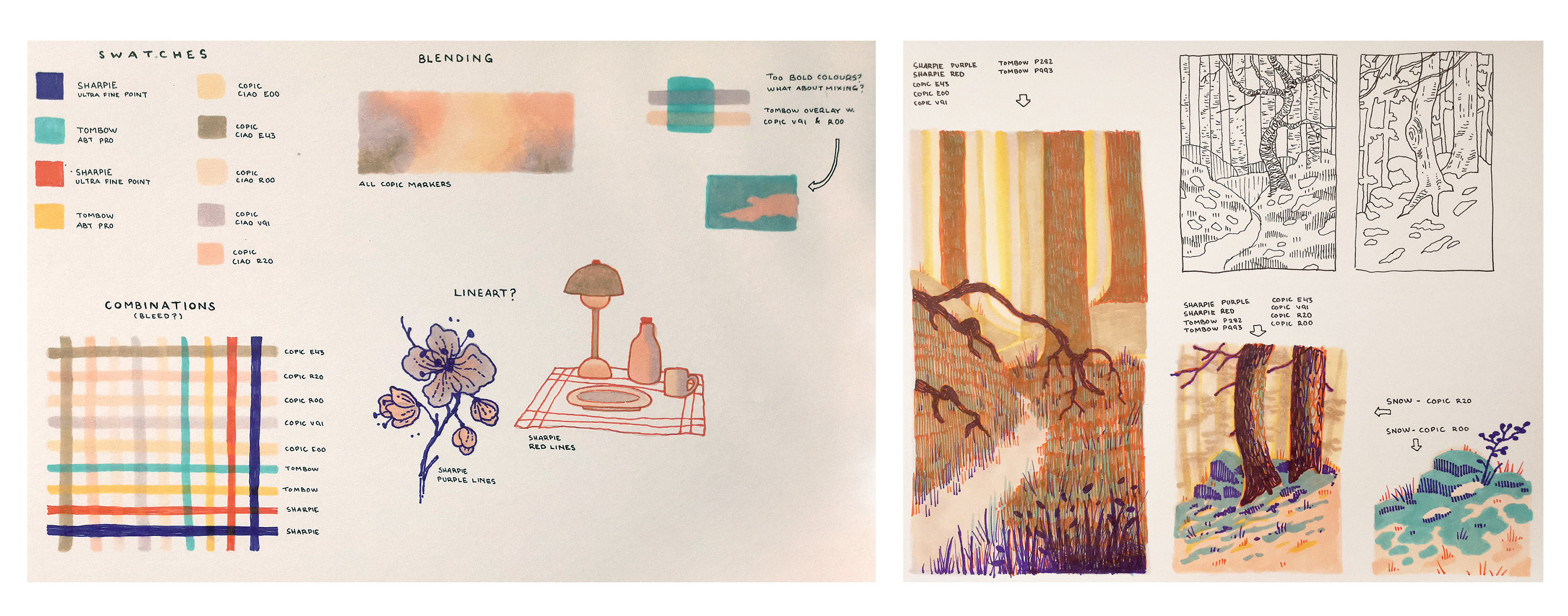
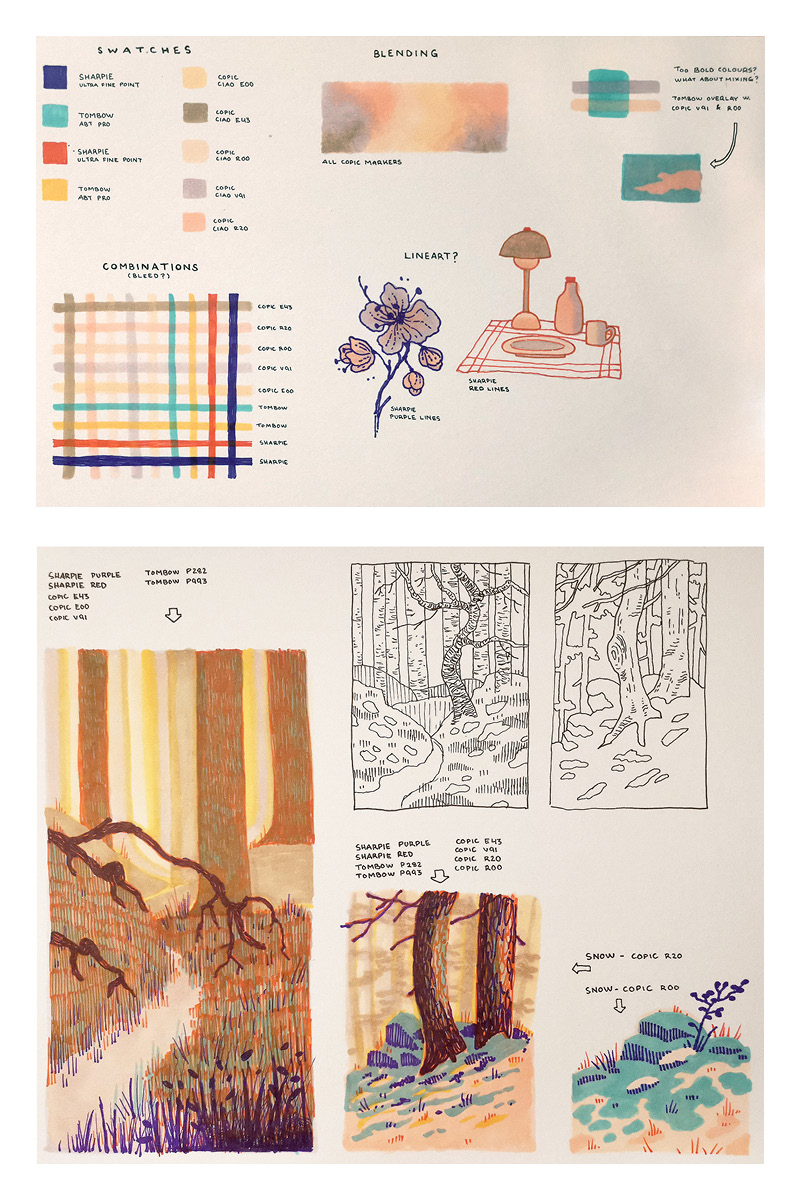
Step 1. Get to know your colour palette
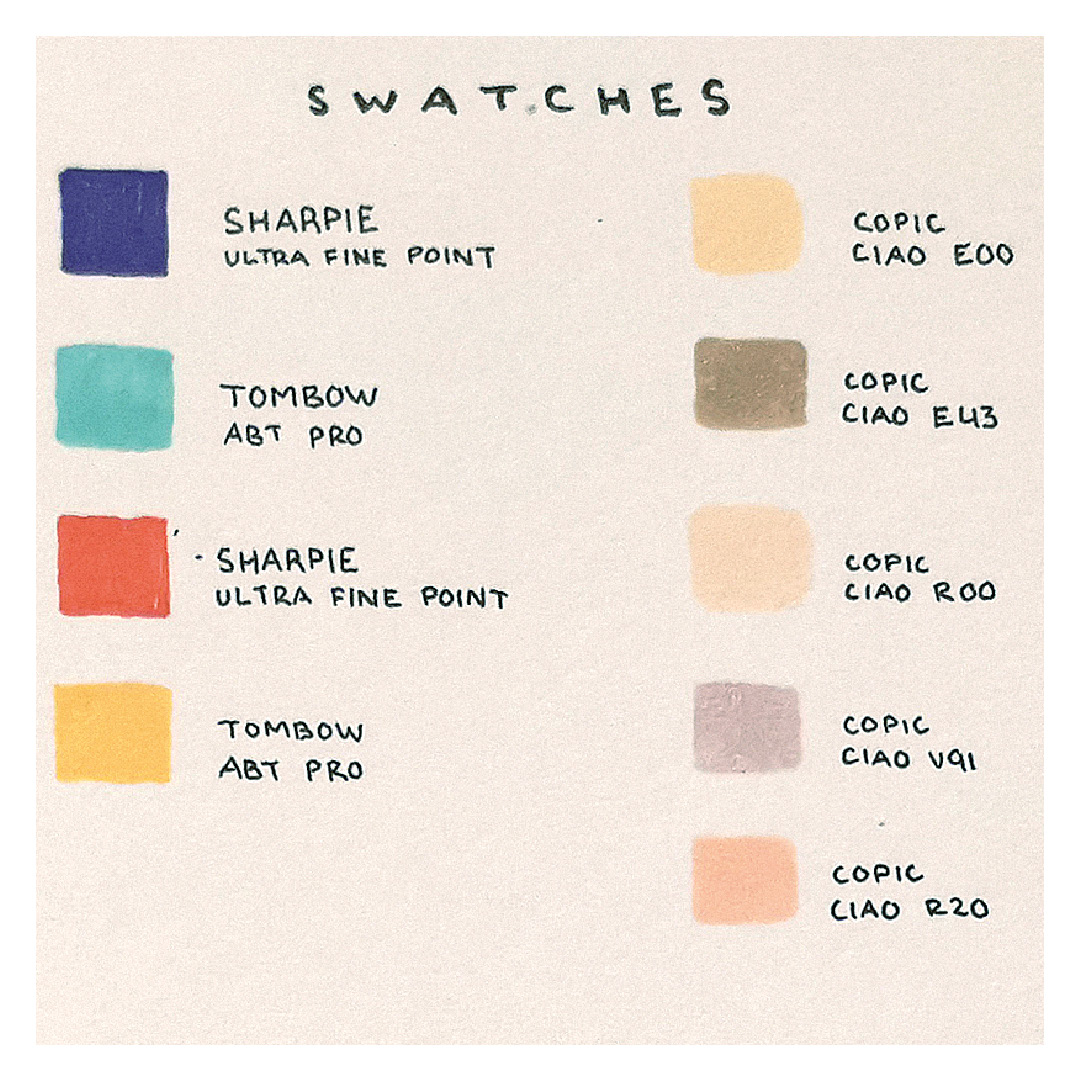
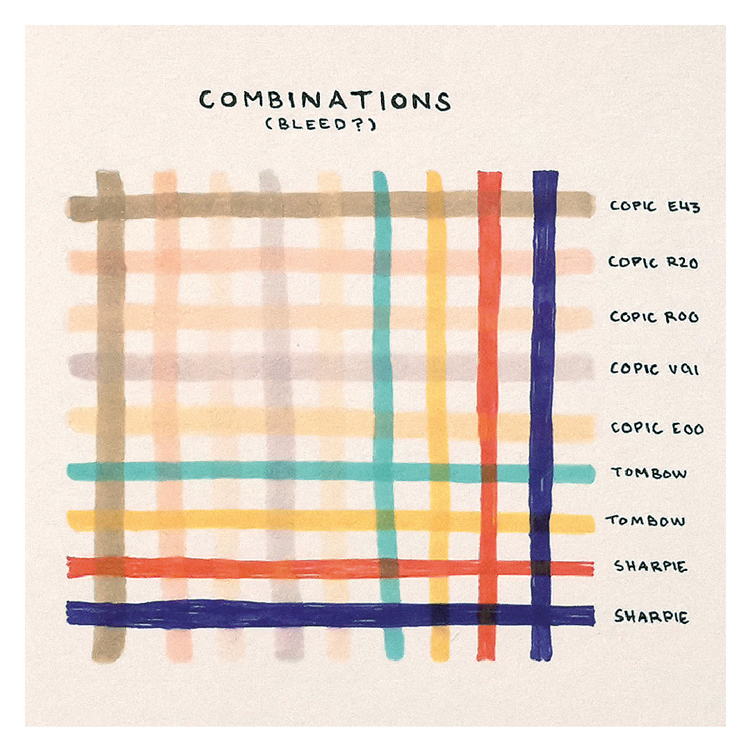
When working with different types of pens within the same motif, it is important to familiarise yourself with each pen, its colours and its characteristics. The first thing I do in a process like this is explore the entire colour palette. For this motif, I have been given eight different pens to work with. I simply draw squares, filling each one with a single colour. This gives me an overview of all the colours available. I then want to understand how the different pens interact. One way to do this is by creating a grid where all the colours meet. With the help of such a grid, I can see whether new colour combinations emerge or whether certain colours dominate others.
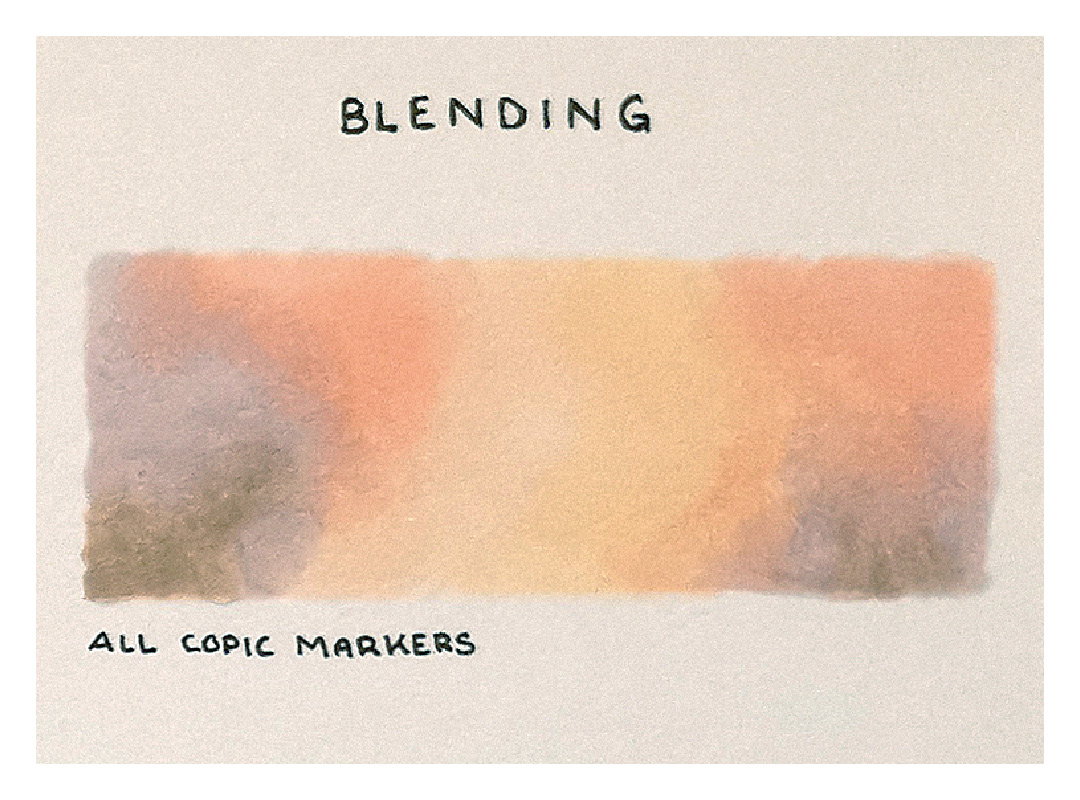
Step 2. Explore how the colours can be blended
If you are using a marker or coloured pencil, you can experiment with blending the colours to create soft transitions between different shades. Coloured pencils can also create interesting textures when layered over marker or watercolour.
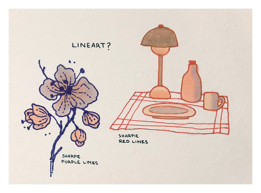
Step 3. Explore different colour combinations within a larger composition
Once I have familiarised myself with the pens and their colours, I continue by drawing small sketches and thumbnail studies to test different colour combinations within a larger composition.
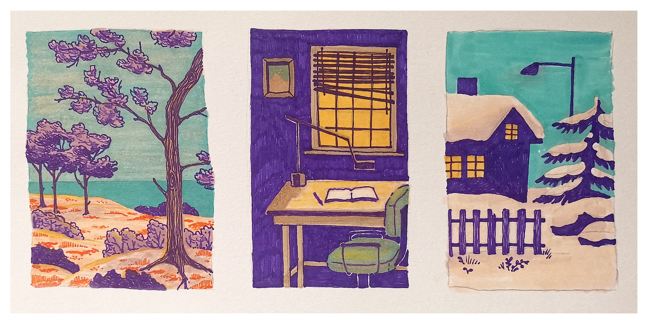
I had five Copic pens in fairly similar shades of pink and beige. In contrast to the soft tones, I also had four markers in stronger colours such as purple, turquoise, red and yellow. The purple in particular stood out in clear contrast to the rest.
I tried drawing several motifs until I found a combination where the colours worked together in an interesting way. I could have reduced the number of colours and tools, but I wanted to challenge myself and use them all, even though I found the purple difficult to work with.
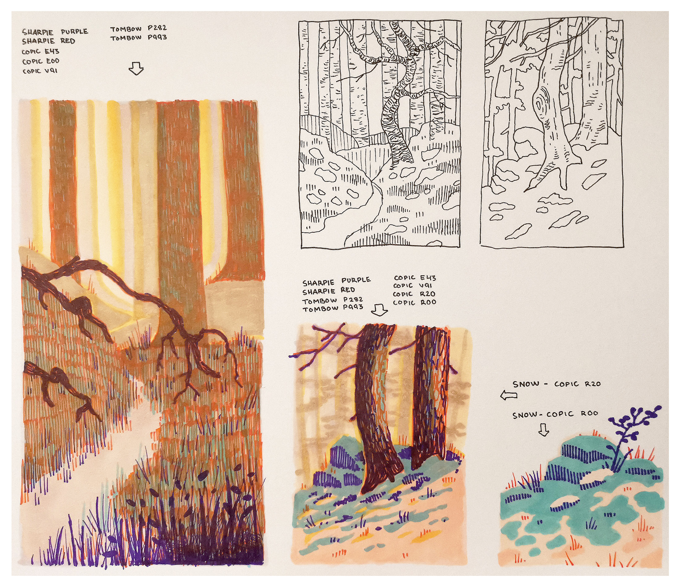
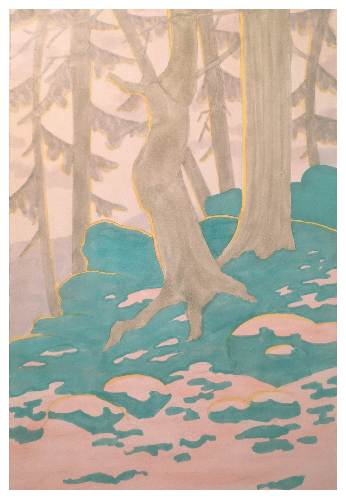
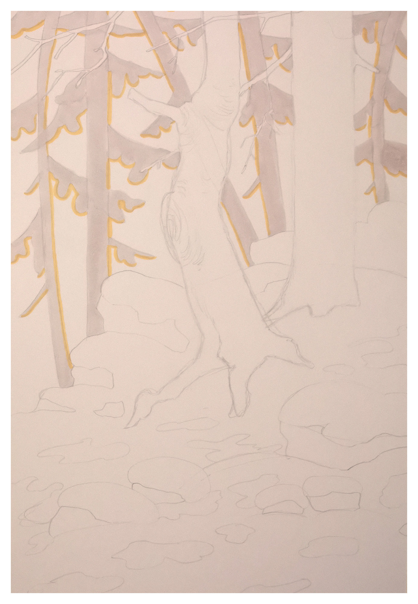
Step 4. Develop the colour combination you like most
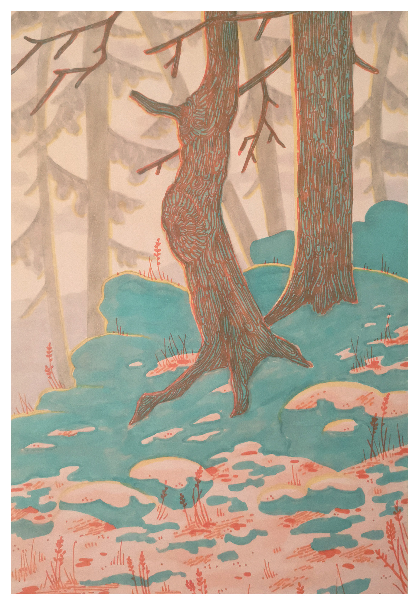
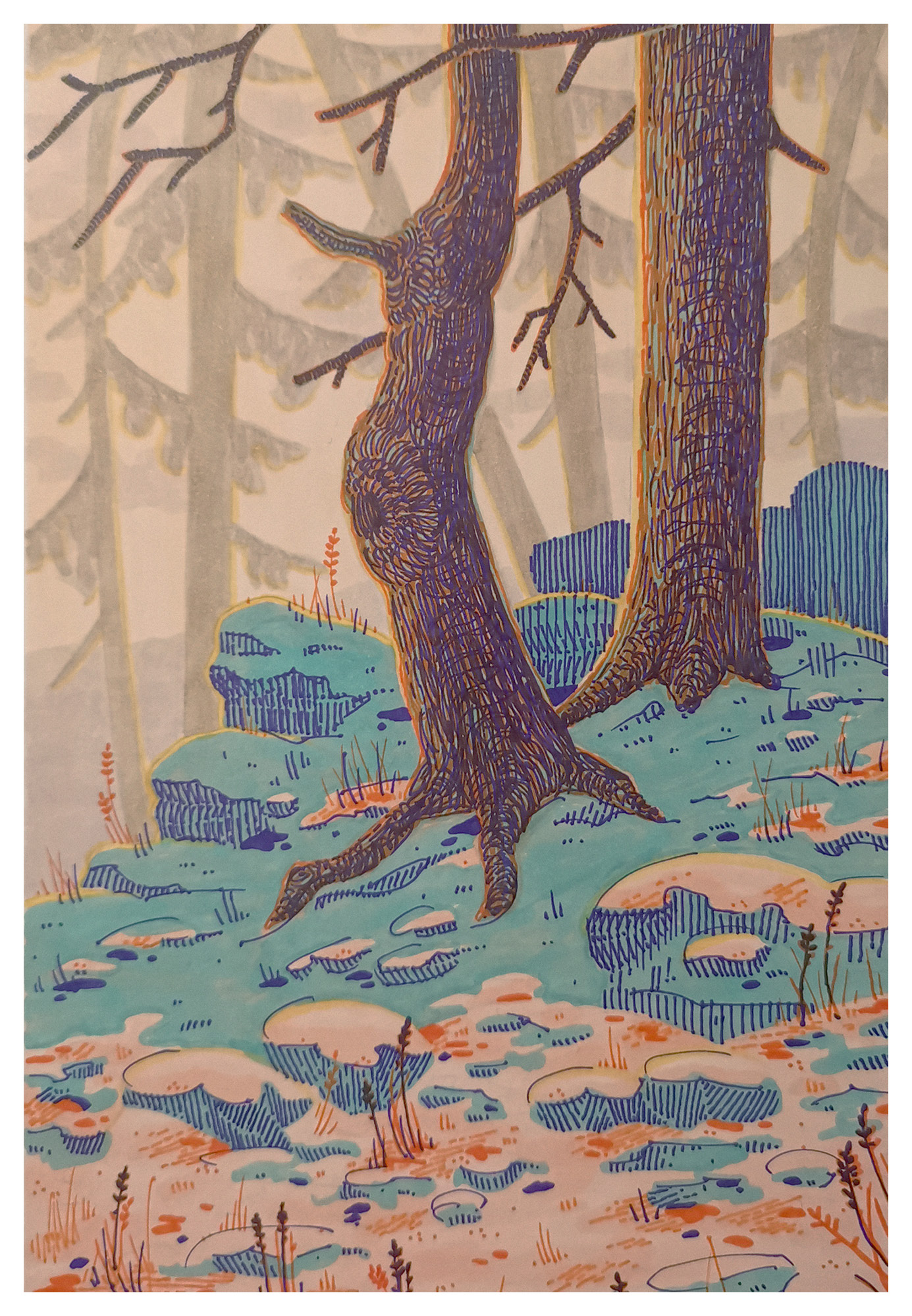
After several attempts, I decided to draw a forest landscape where the Copic pens in various shades of pink and beige create a soft and warm background. The main motif is two trees set on a snow-covered slope, where stones, heather and grass peek through the snow. Shadows in the snow are illustrated with turquoise, contrasting with the otherwise pink-toned snow that may evoke a winter sunset. Both red and purple are used to add details and create further depth in the shadows. Yellow is used sparingly to suggest a glow from the sun.
This is how I built up the motif layer by layer:
I began by laying down the base for the trees and the snow with light shades of pink and beige. I also used yellow to give the trees a hint of sunlight.
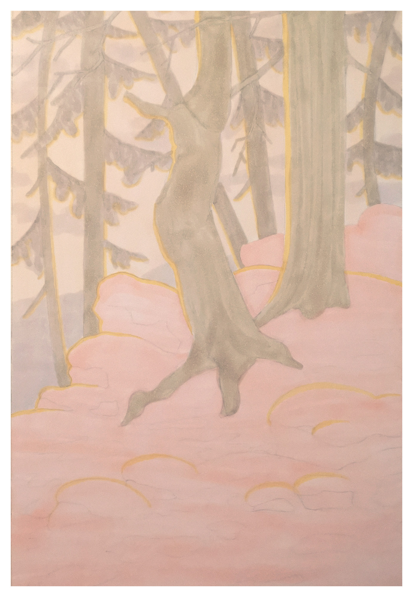
I then outlined the contours of the snow in turquoise and added details in red. Finally, I finished the last details and shadows in purple. The red and purple tones helped give the illustration texture and additional detail.
Maria M Nilsen@finchlunch.art