Ireland (EUR)
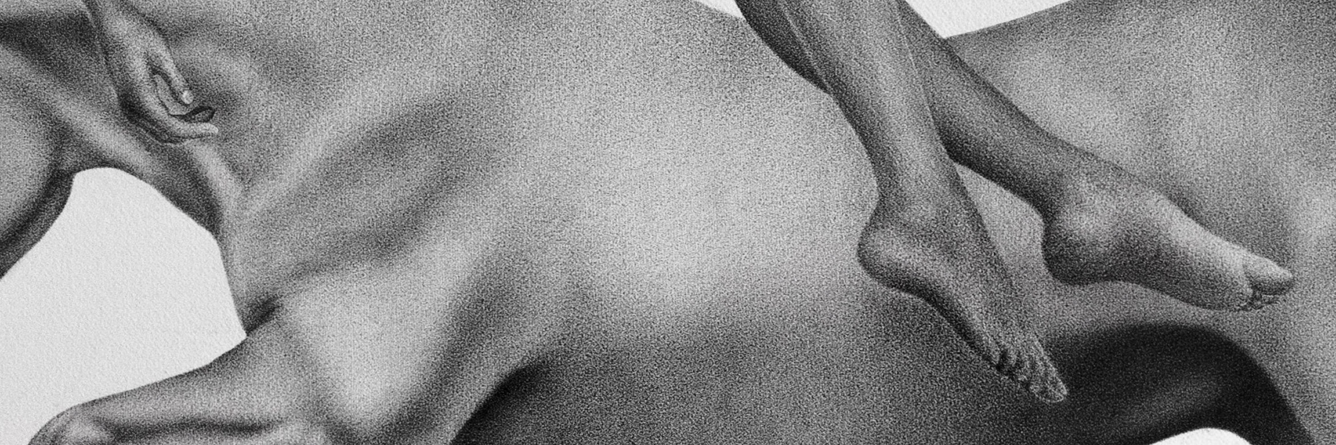
Learn how to stipple with the artist Julia Koceva.
What exactly is stippling or dotting? Stippling means, through small dots, creating patterns that simulate different degrees of light and shadows in what is being portrayed. Stippling or dotting differs from pointillism, where the creator uses different colors from the palette to simulate a mixture of these on the paper / canvas. George Seurat is considered the father of pointillism, also called divisionism, in 19th century France. There are examples of stippling as early as the 1510s by Giulio Campagnola who used the technique in engraving.
Julia, what kind of material do you use?
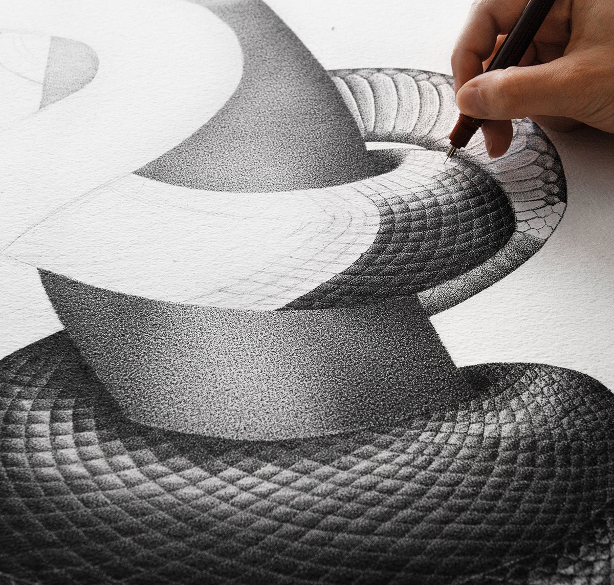
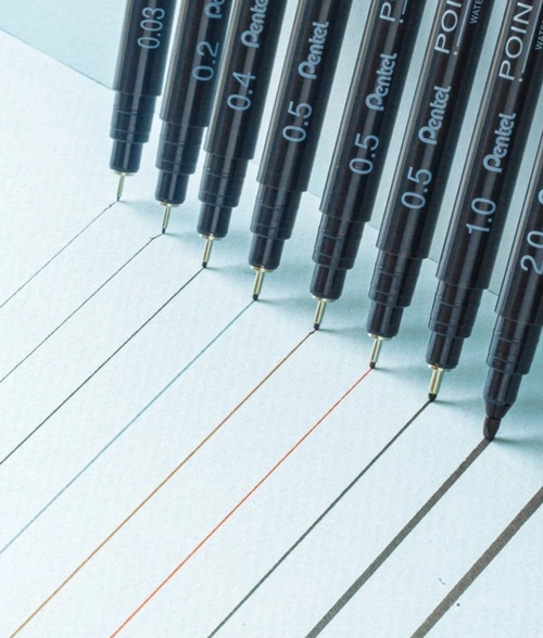
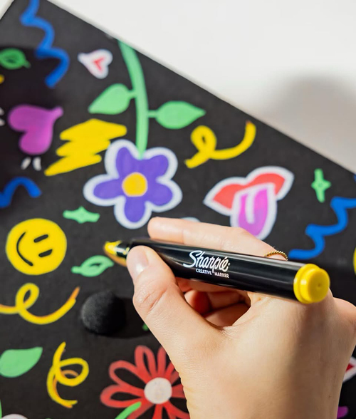
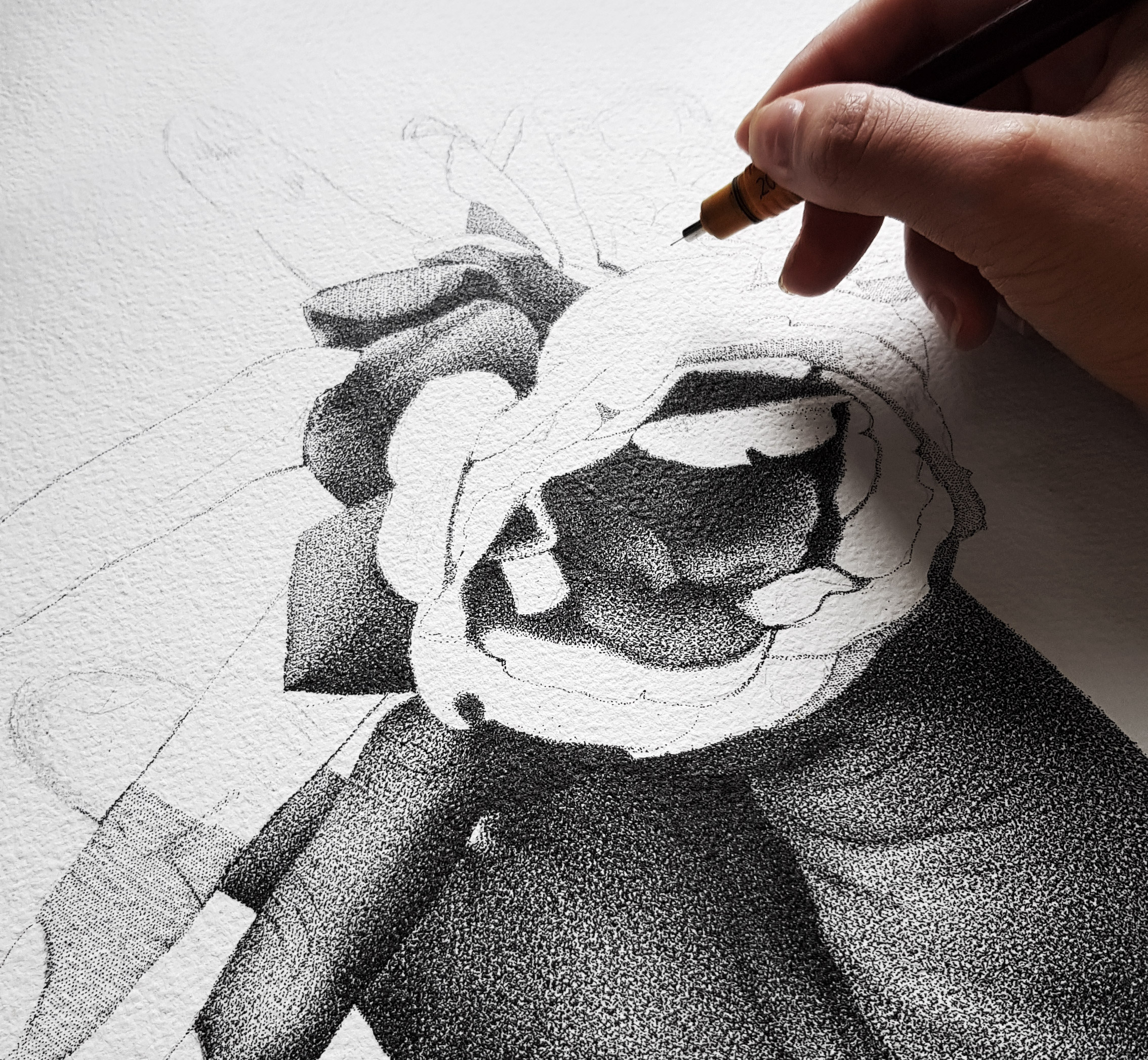
To create artworks, I use Rotring Rapidograph 0.1 mm on watercolor paper from Arches. Rotring Rapidograph is a fineliner with ink on a cartridge.
The replaceable cartridges make it easy to work with. The pen consists of a durable body and chrome-plated tip. In addition to the 0.1 mm tip that I myself use, you can choose from a number of different sizes of the tip depending on what you are after. By using the thinnest tip Rotring Rapidograph has to offer, I also increase the degree of realism in this way.
>Why did you choose this method to work with?
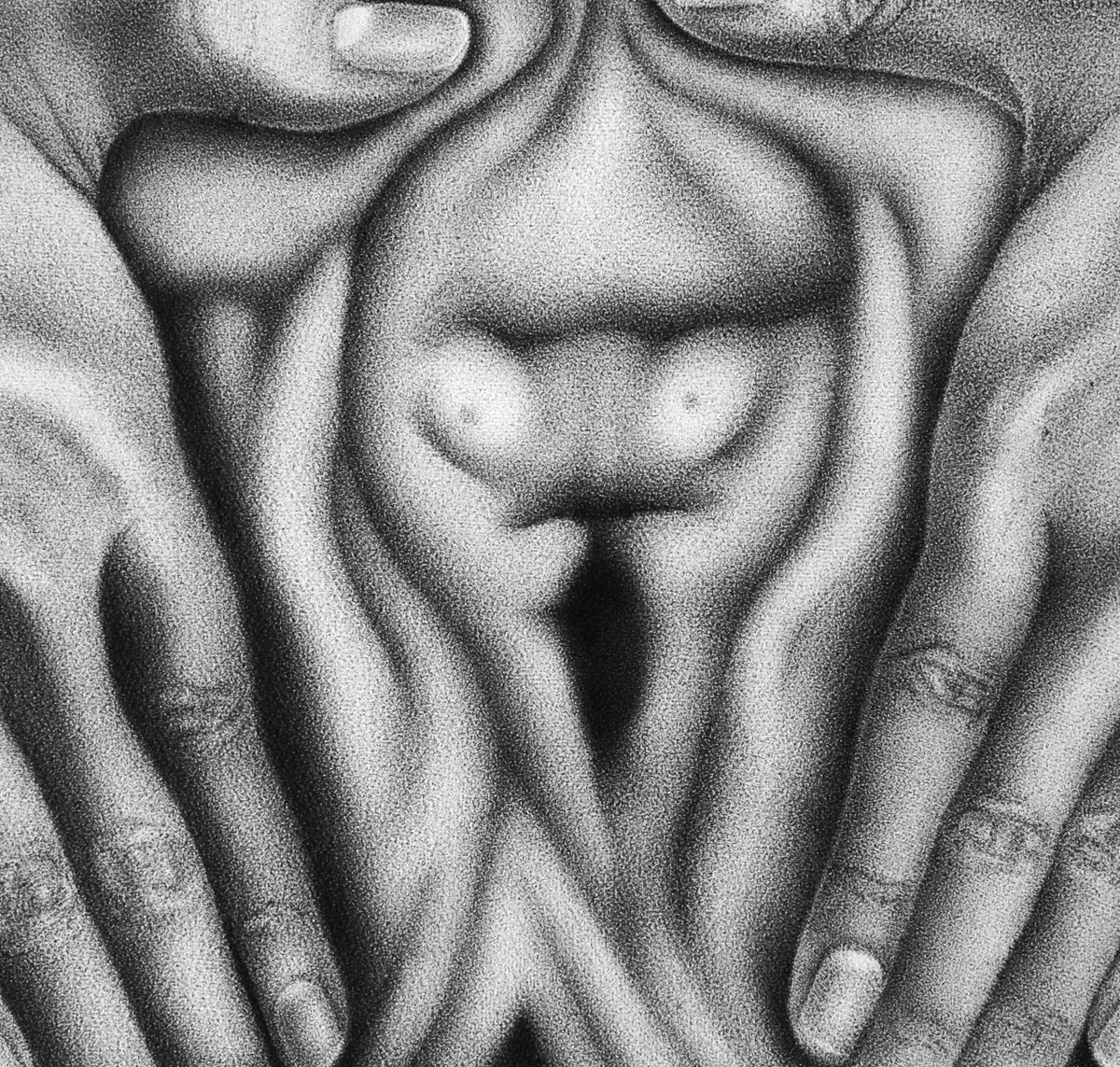
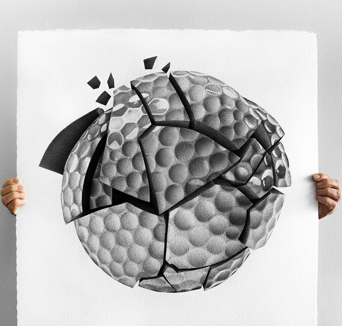
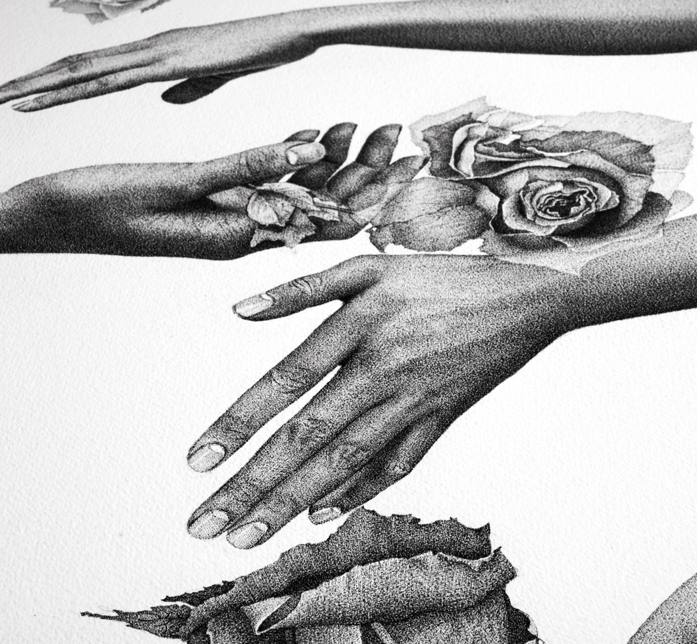
I use the stippling technique to achieve the greatest possible degree of realism and the right balance between light and shadows. Dotting is an interesting concept, I think. Instead of drawing a circle with a simple movement you draw it by placing dots and creating the illusion of a circle. The technology allows the viewer to fill in the gaps and create a complete picture of the product. The longer the distance you have from the work piece you are viewing, the more realistic it seems. Sometimes the individual dots are not perceived if you do not look closely.
How do you proceed when creating, step by step?
When you want to create a work using dotting, you can use a number of different ways. When you have a sketch or an idea of what you want to create, you can start "grazing" part by part. This is perhaps the easiest way to start, especially if you also use the "grid method". The grid method is drawing using a grid system to get the correct proportions.


During the creation of my works, I usually start by identifying the brightest part of the drawing, the so-called negative surface, a surface within a larger area. Dotting creates more effects depending on how much negative surface you leave. The more dots you use and the denser placement, the more you reduce the contrast in your artworks. When you use fewer dots, i.e. a larger proportion of negative surface, the surface seems brighter and more prominent.
I place my dots in rows and layers. I usually place the dots as two columns until the entire surface I am going to draw on is covered with a layer of dots. I usually put around 2-3 layers for the brightest parts. Then I "build" on dots to create the darker parts. The more layers - the darker the illustration. The process is slow and methodical, but I personally think it gives an increased control while working, as well as a smooth and even surface.
Any other tips?
When you want to create texture in dotting, it is important to identify where you assume the light might land on the object you are drawing. The texture is drawn by marking the negative surface with the help of more dots, you create the illusion of a shadow. A drawing with more dots and less negative surface is usually perceived as having a higher degree of texture.
If you want to draw a landscape or create perspective in your artwork, you can keep in mind that what is to be perceived as closer to the viewer should be drawn with greater sharpness than what is to be perceived as a background.
When it comes to choosing a base for dotting, there are really unlimited alternatives. As previously mentioned, I draw on paper from Arches. It is a very thick paper in cotton with a lot of structure. Arches offers a range of thicknesses and textures. In my artworks, I strive for realism, but also a "smoothness", then I think that the dots blend in nicely in the surface I work on. The dots become less prominent as individual units if you do not look closely. If, on the other hand, you want to create illustrations with high precision and sharpness, a smoother paper can be conceivable as a surface.
Julia Koceva