Ireland (EUR)
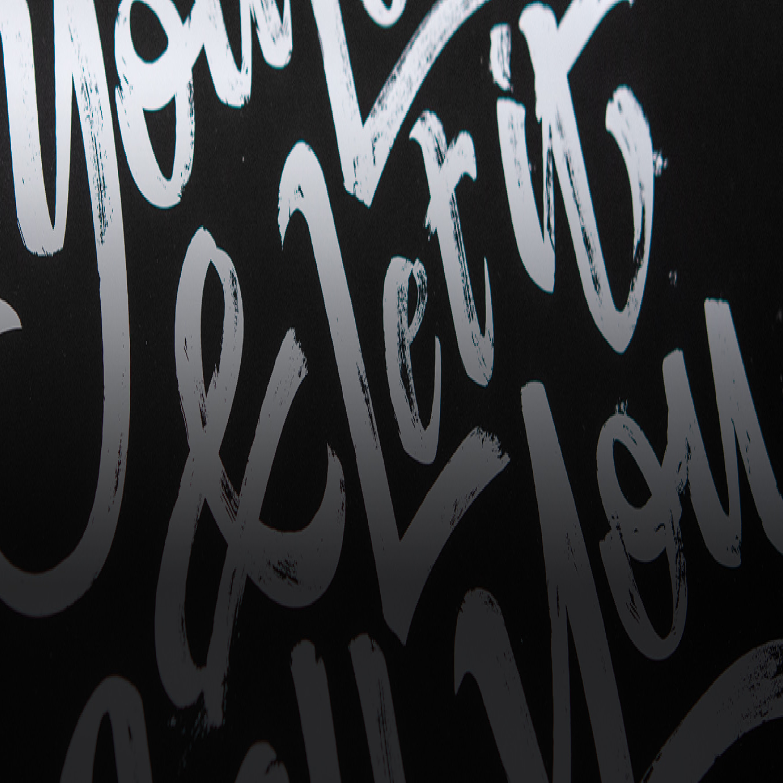
21 tips for drawing neater letters
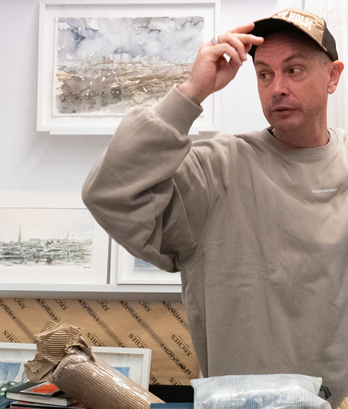
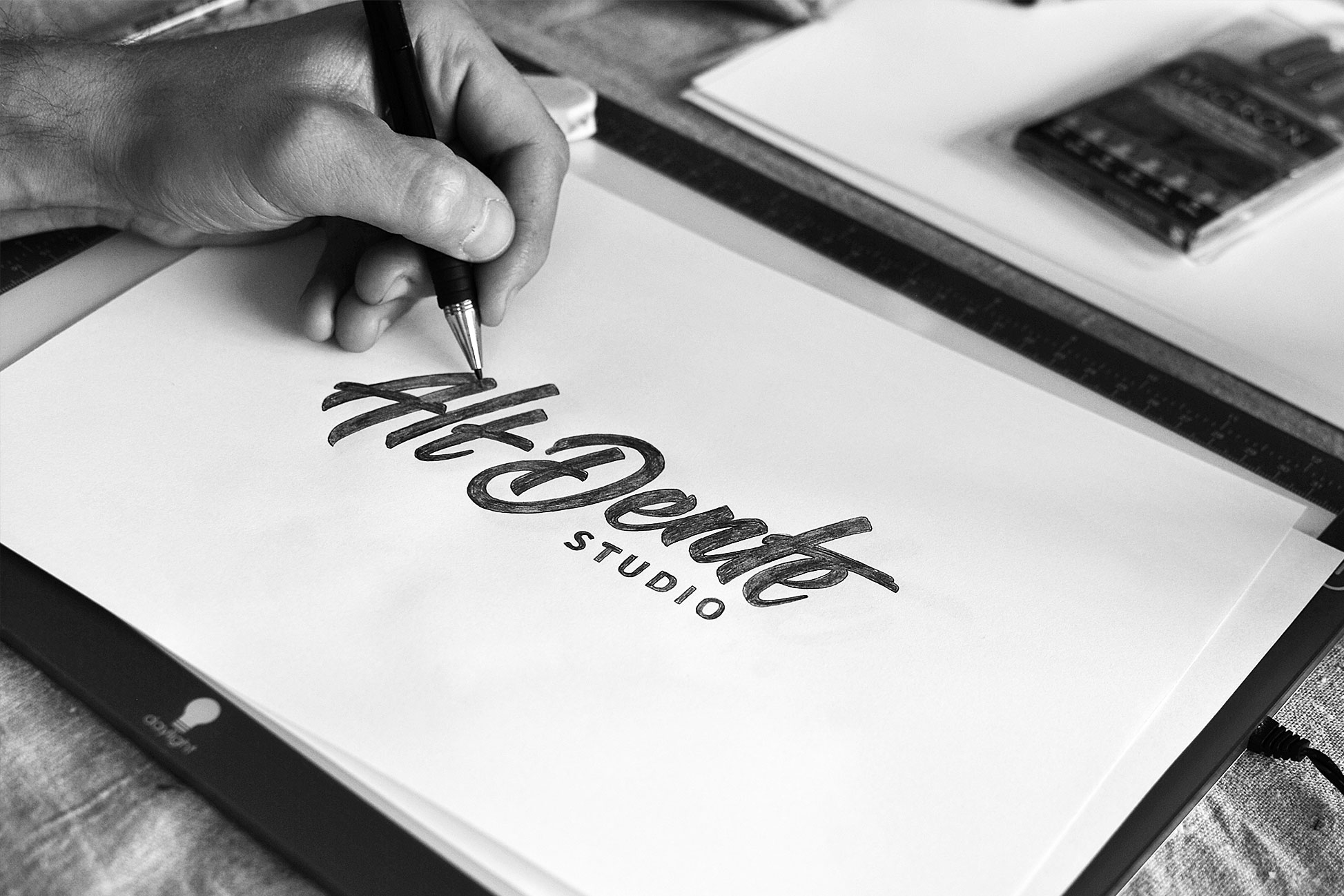
Letters are my big passion! Since 2015 I run Björn Berglund Creative Studio, which has a focus on letters, designing logotypes and creating visual identities. The good thing about lettering is that you really do not need anything fancy to get started. You will get far with ordinary paper, an eraser, your pen of choice and, perhaps most importantly, patience.
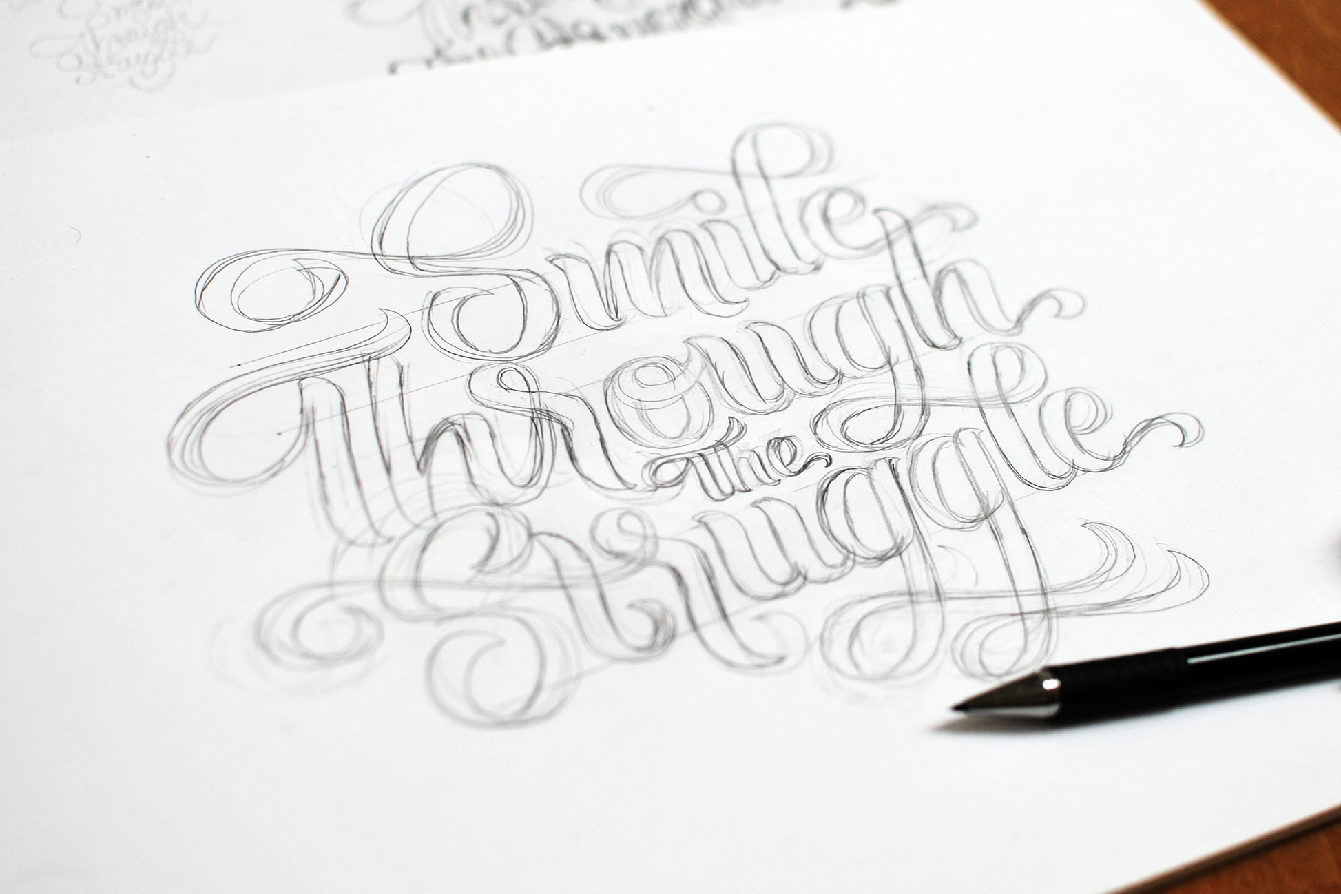
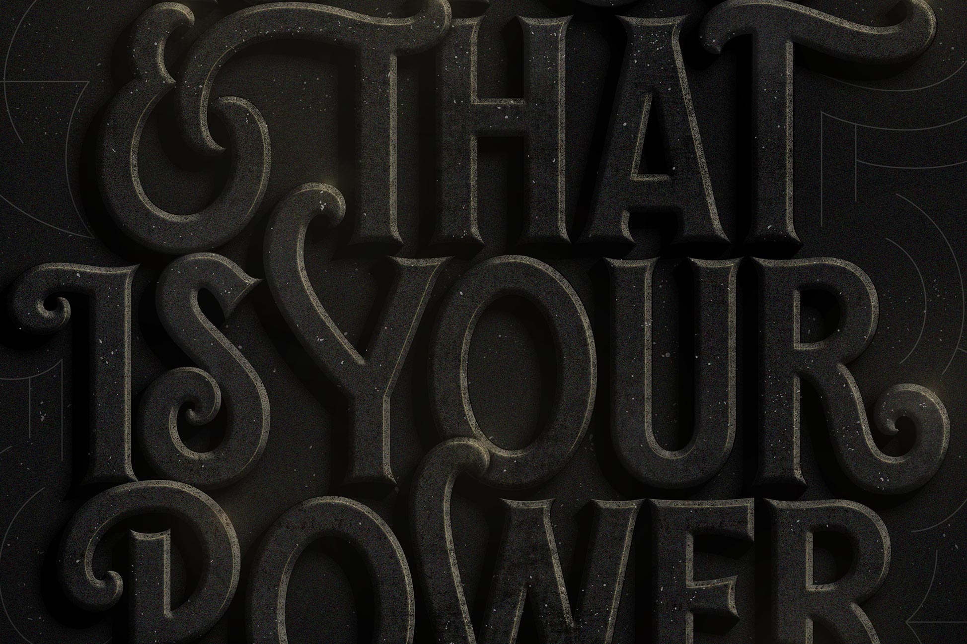
To me, inspiration is the foundation for creativity – it can come from a song lyric or from a good film. With it, an idea for an image usually comes along. To get started I usually collect a bunch of inspirational images. After that I start sketching. That is when I let go of the inspirational images and start sketching from my own ideas. Initially, the most important thing is to find an overall composition. Outlines of thumbnail size are recommended. The letters do not need to be perfect; the overall idea is more important. Usually, I create a lot of drafts and then trace draw the best ones. Once I have got a working composition – and a somewhat clear idea of what I want the final result to look like – I transfer the sketch to the computer for vectorisation. I do that by trace drawing the sketch from scratch in Adobe Illustrator. In this phase the flaws of the image become clear, so I sometimes print my design and keep sketching. Other times I put my drawings into Adobe Photoshop to add textures, light effects and so on. Here are some of my tips and tricks when it comes to lettering.
1.
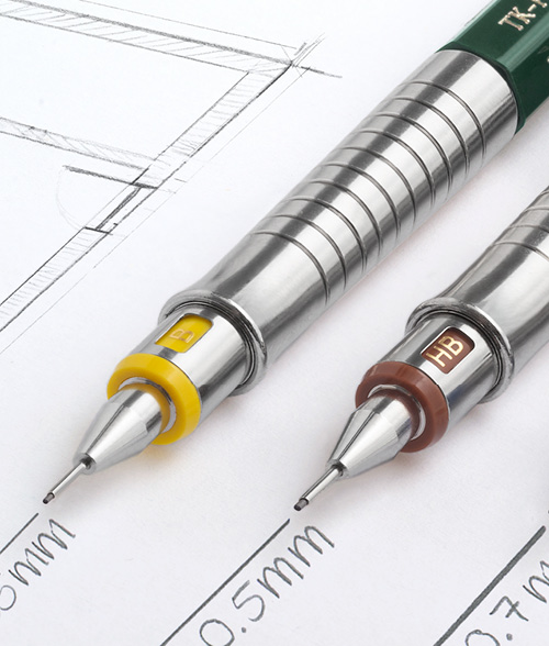
– You can make the direction of an illustration stronger by putting a horizontal line beneath it, which will follow the letters. The pencil I use is usually a Graphgear 500 from Pentel, with a 0.3mm line size.

2.
– You can recreate a specific feeling of texture on your letters. Here, I have used a Promarker pencil – I do love those pencils!.

3.
– Keep in mind that letters can be so much more than traditional handwriting, or serifs like Times New Roman – those who seek shall find! And when it does not work, you can always erase. I use an eraser from Staedtler.
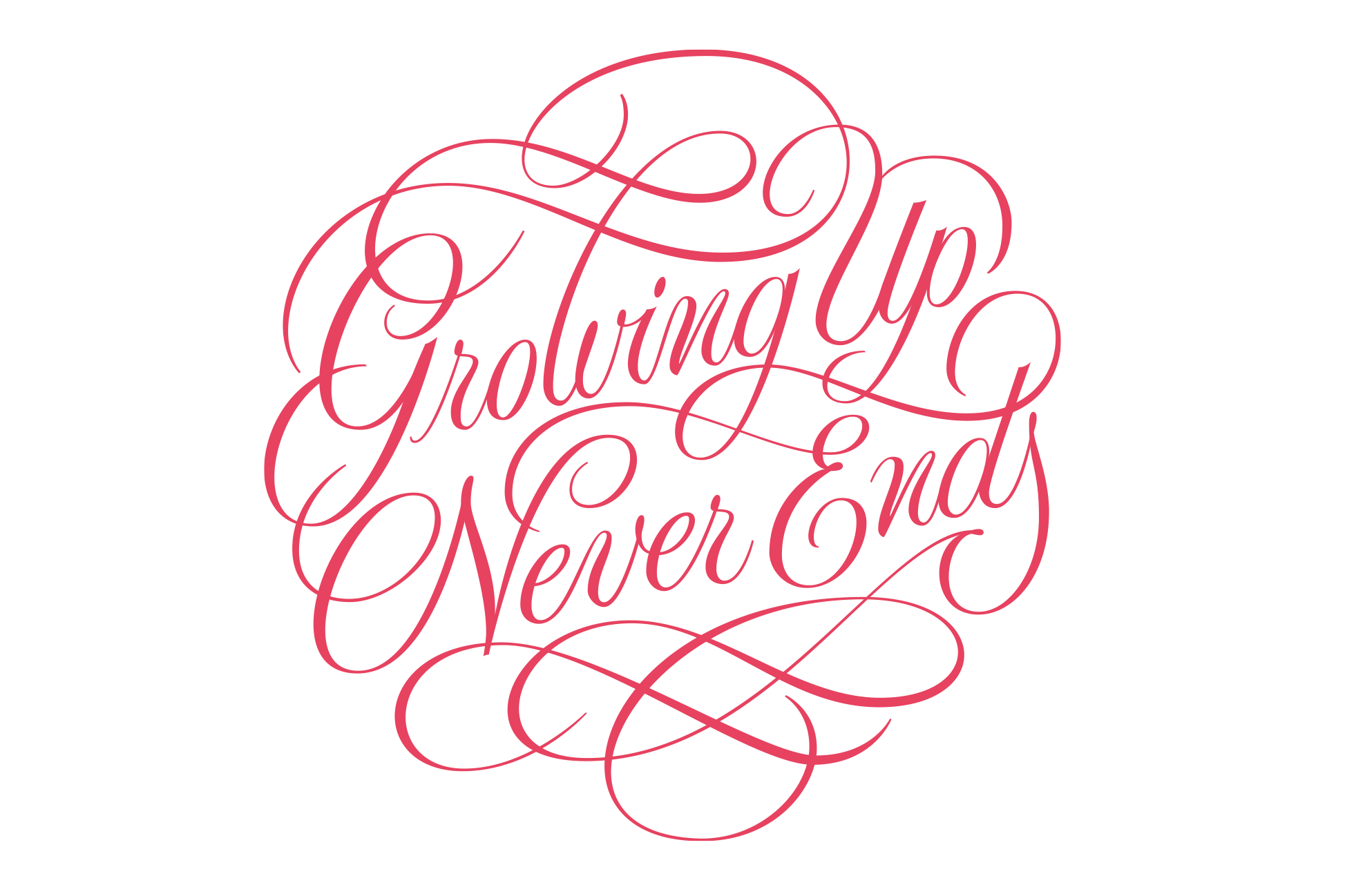
4.
– It is fun to play around with swashes and flourishes. Try not to go completely bananas, and do be consistent with thickness and curves.
5.
– If you want a more analogue feel to your design: Use stippling. That means filling your drawing with tiny dots. My favourite pencil for stippling is Pigma Micron Fineliner, usually 0.05mm.
6.
– Disposition is the most important first step – after that is done, you can focus on the details. A good sketching paper is, for example, Hahnemühle. Choose a spiral binder if you can.
7.
– An illustration with letters can be very impactful. Here, I have used Promarker pencils.
8.
– A similar beginning and end for words, rows, or letters gives harmony.

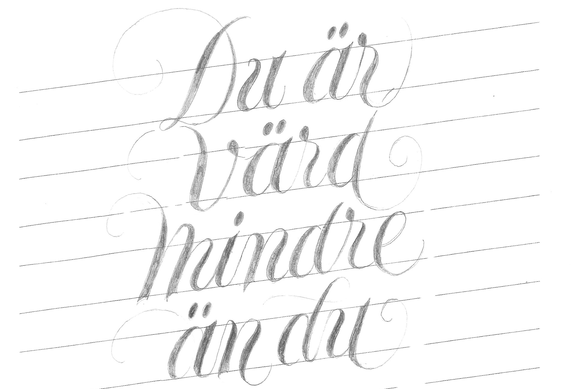
9.
– In a complex text with a lot of words and rows, you can use lines to create balance and structure. In this example I have used multiple horizontal lines!
10.
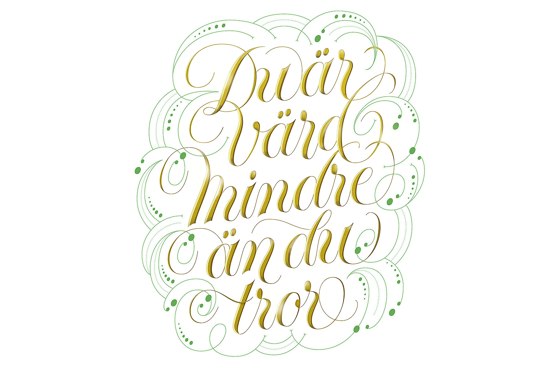
– Ornamentation around your letters can enhance the shape/composition.
11.
– To get the same size on different letters when you sketch, use lines for support. Draw them with a ruler.
12.
– For a voluminous and powerful image, you can use shading and exposure to create a three-dimensional feeling.
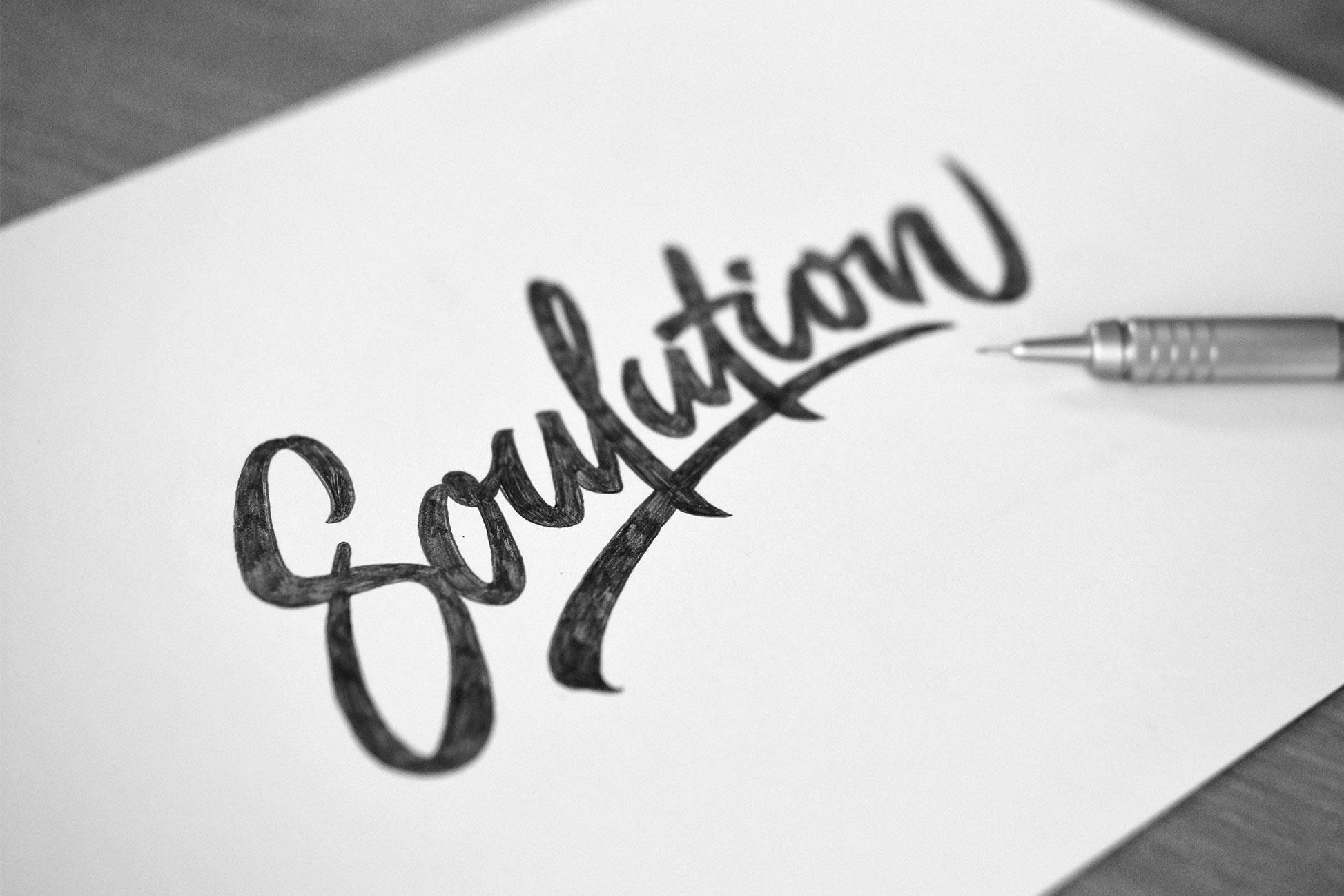
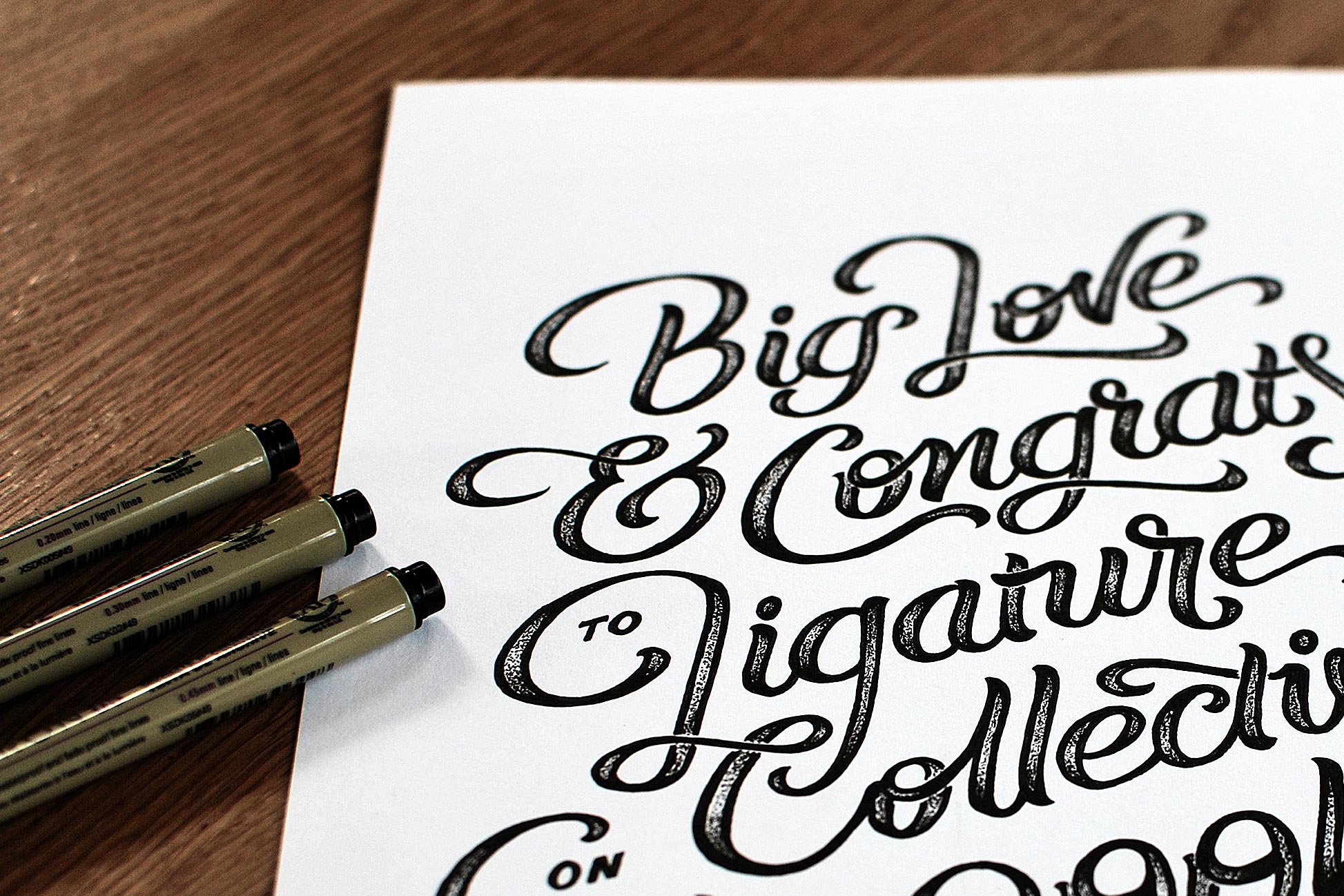
13.
– Ligatures, which means connecting letters, can be used as a way to create a unique expression.

14.
– Try to find a style and an expression that aligns with whatever you are supposed to express.

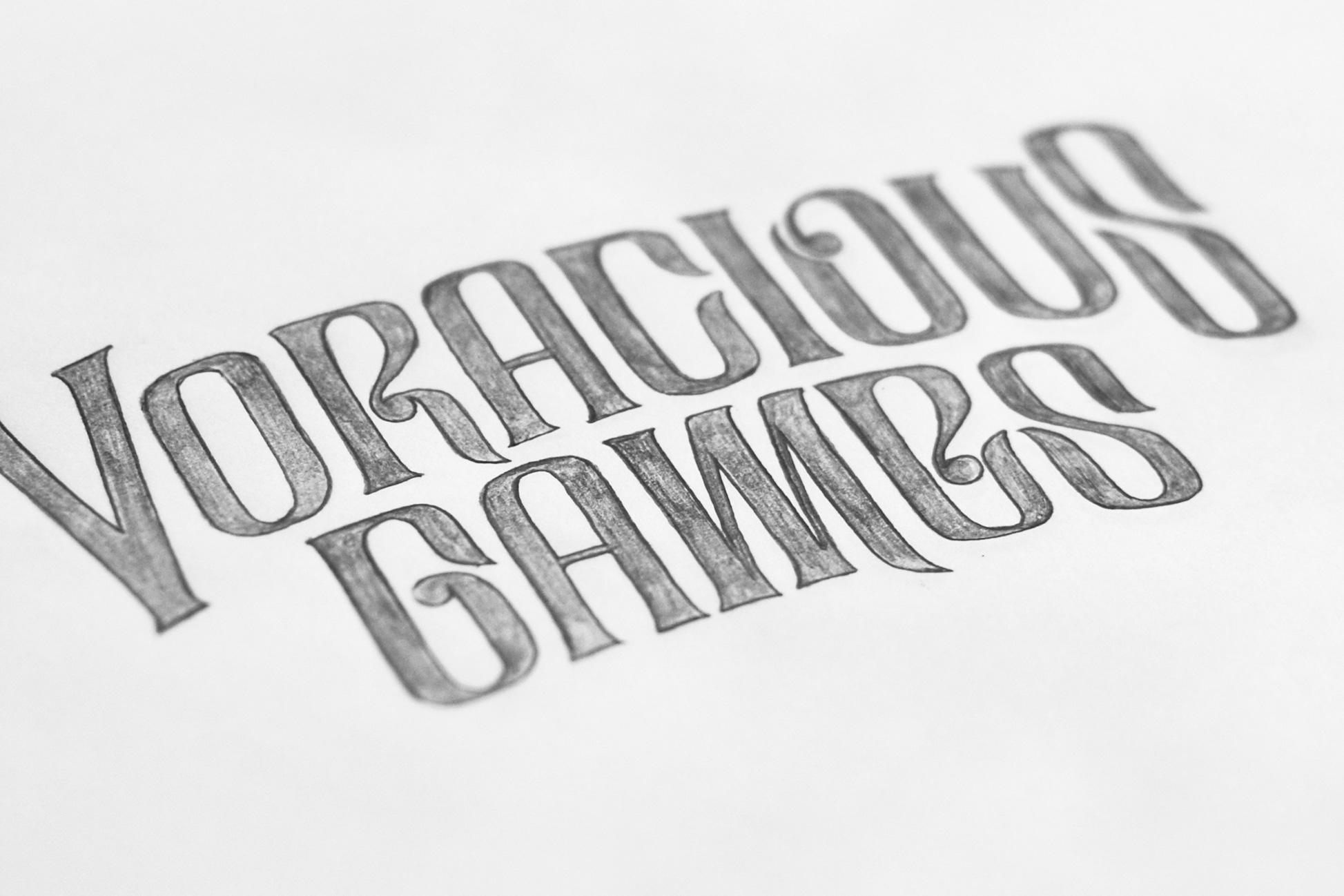
15.
– Details are what creates character. For example, change the letters’ serifs to create a different feeling.
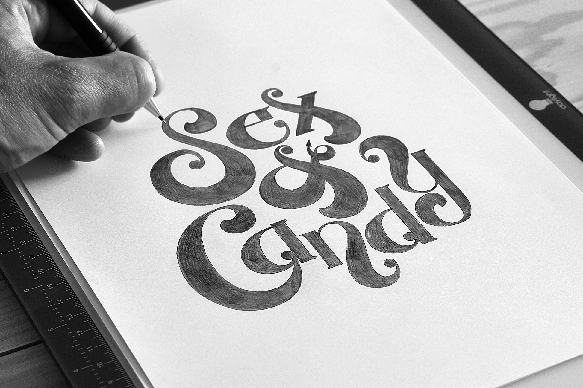
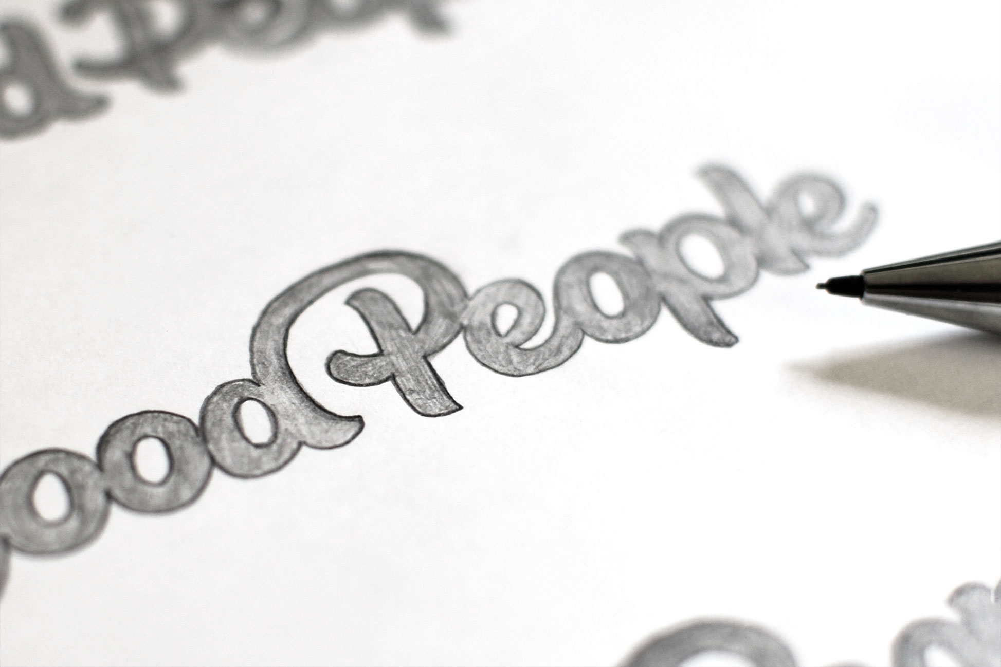
16.
– If you have the word ‘and’ in the text – try to switch it out for an ampersand. They are usually very fun to draw and have infinite variations to them.
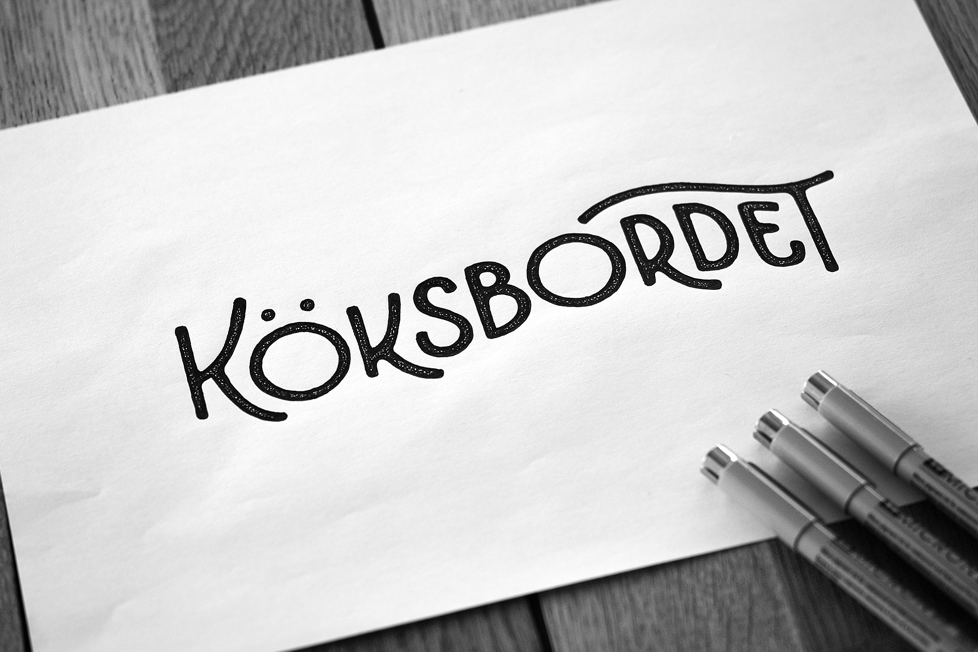
17.
– When you can, add subtle easter eggs to your illustrations – a billowy base line can symbolise a connection to the sea, for example.
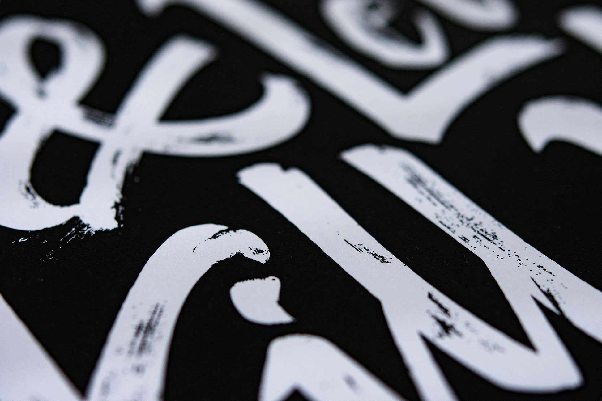
18.
– Texture and structure adds to the impression. Here, I have kept the brushstrokes, for a feeling that is rougher around the edges. My favourite brush pen is probably Pigma MB Sakura.
19.
– A cat among pigeons. Sometimes it can be motivated to mix in a lower-case letter amongst the capital letters – and the other way around. Rules are meant to be broken.
20.
– Try forcing your letters into geometrical shapes – it can be very interesting!
21.
– The light table is your friend! This way you can recreate your last sketch and correct whatever you are not satisfied with. If you do not own a light table, you can use a window.